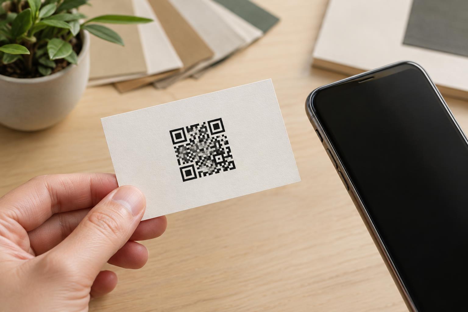
Design and PrintA QR code can give a business card a useful next step, but the small format leaves little room for mistakes. Learn how to choose a destination, protect the code in the layout, and test the finished card.
Read article · 3 min↗
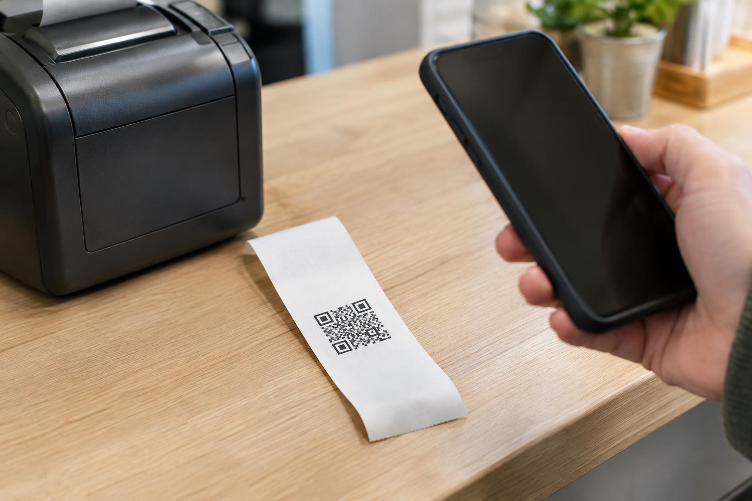
Design and PrintA receipt QR code has to survive a narrow paper roll, uneven printing, and everyday handling. Learn how to plan its size, position, destination, and real-world test before adding it to a checkout receipt.
Read article · 4 min↗
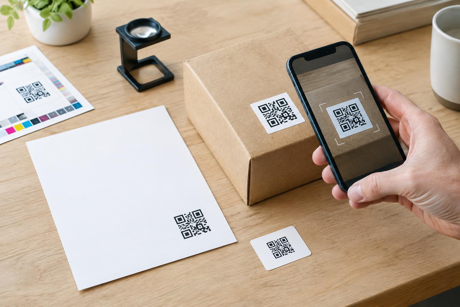
Design and PrintA QR code that works on a screen may fail after printing. Use this prepress checklist to check the destination, artwork, size, contrast, placement, materials, and real-world scanning conditions before approving a print run.
Read article · 4 min↗
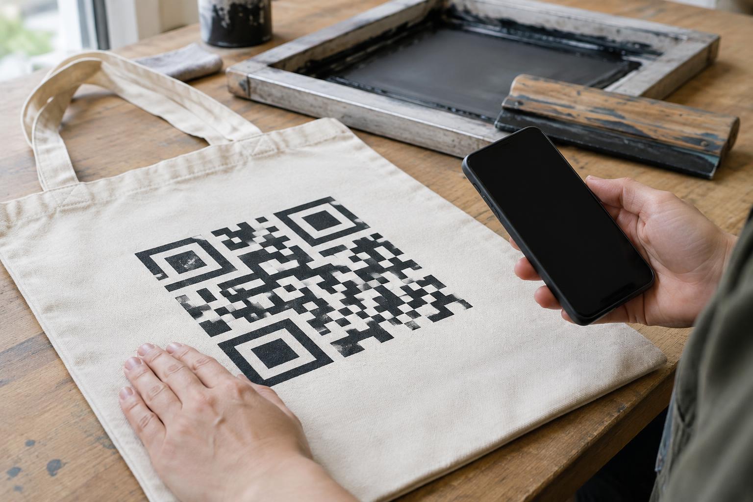
Design and PrintA QR code that looks sharp on a screen may blur when printed on cloth. Learn how fabric texture, ink spread, placement and washing affect scannability, and how to check a sample before producing a full run.
Read article · 4 min↗
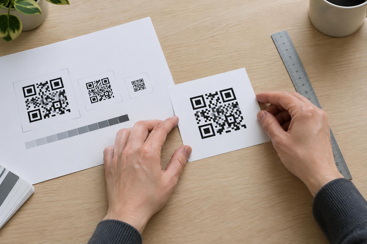
Design and PrintStretching a QR code in layout software can turn its square modules into rectangles, blur their edges or crowd the clear space around the pattern. Learn how to scale codes proportionally, choose suitable artwork and check a print proof before publishing.
Read article · 4 min↗
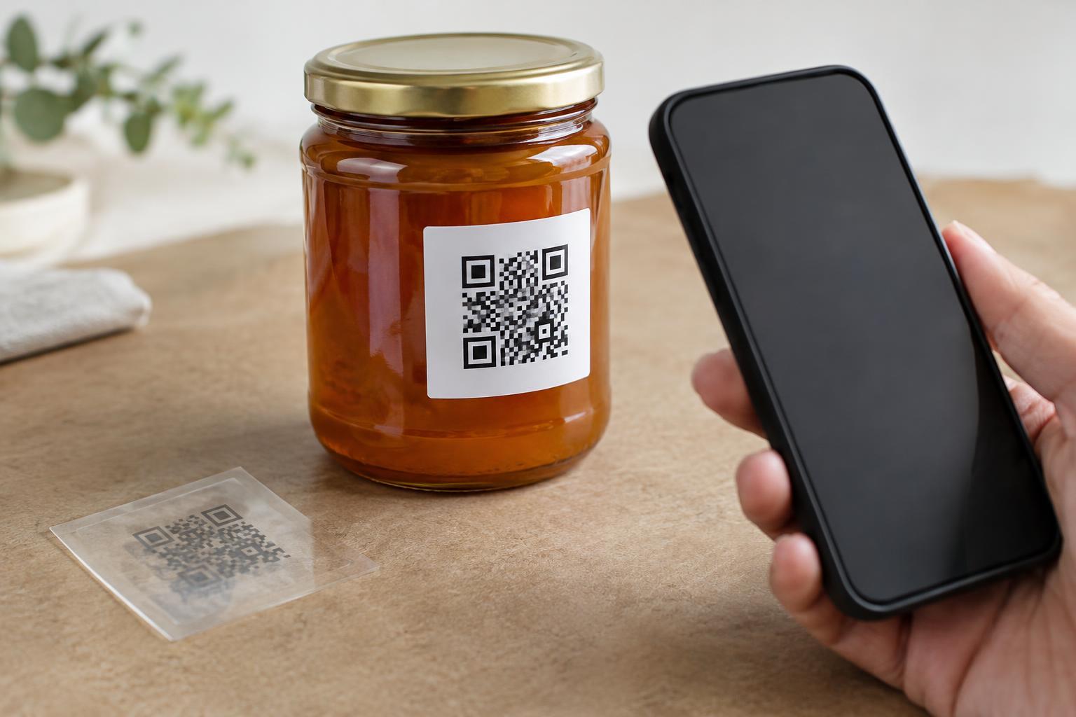
Design and PrintA transparent label can look clean on a package, but the surface beneath it becomes part of the QR code’s design. Learn when to add an opaque backing, how to protect the quiet zone, and what to test before printing a full run.
Read article · 4 min↗
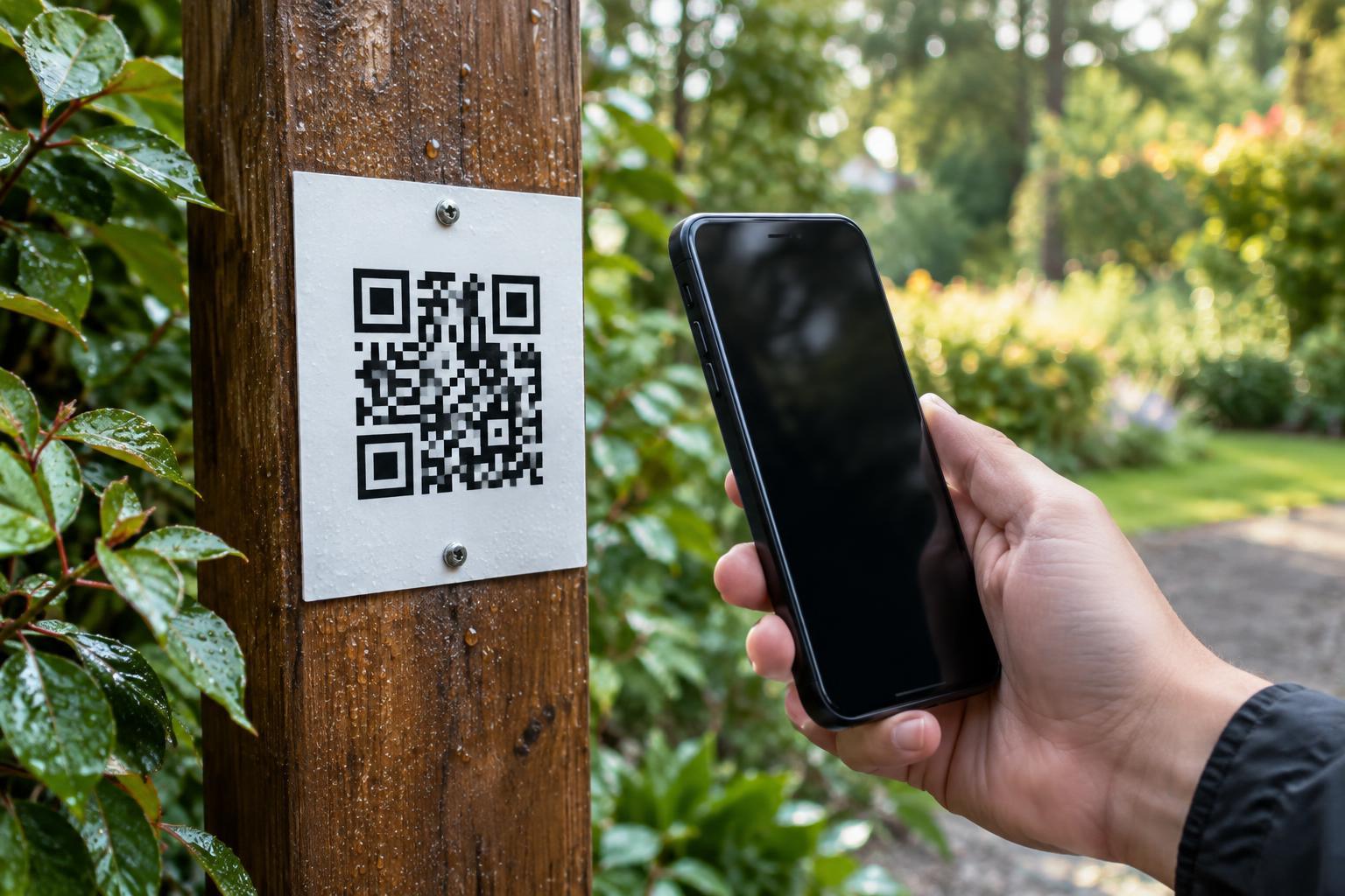
Design and PrintOutdoor QR codes face rain, sunlight, dirt and handling. Learn how to choose a printable material and ink, protect the surface without creating glare, and test the finished sign where people will scan it.
Read article · 4 min↗
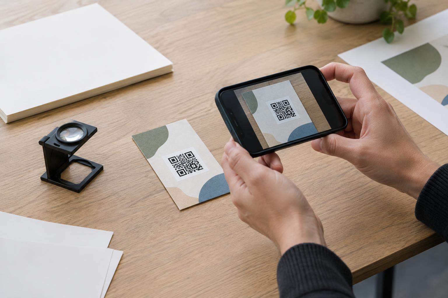
Design and PrintA QR code that looks fine on a screen may be difficult to scan after printing. Learn how to check a physical proof for size, contrast, placement, destination accuracy and real-world usability before approving a full run.
Read article · 4 min↗
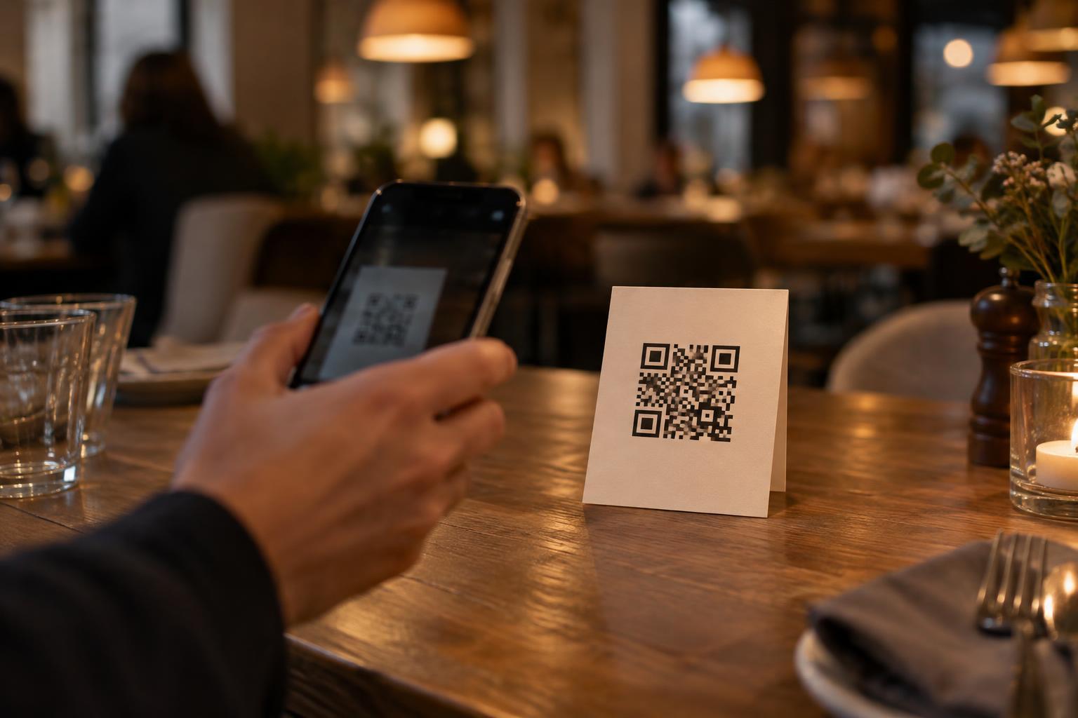
Design and PrintA QR code beside a dim restaurant table or inside a softly lit venue should be easy to scan without asking visitors to turn on their phone’s flash. Learn how contrast, print size, materials, placement and realistic testing can make low-light scanning more dependable.
Read article · 4 min↗
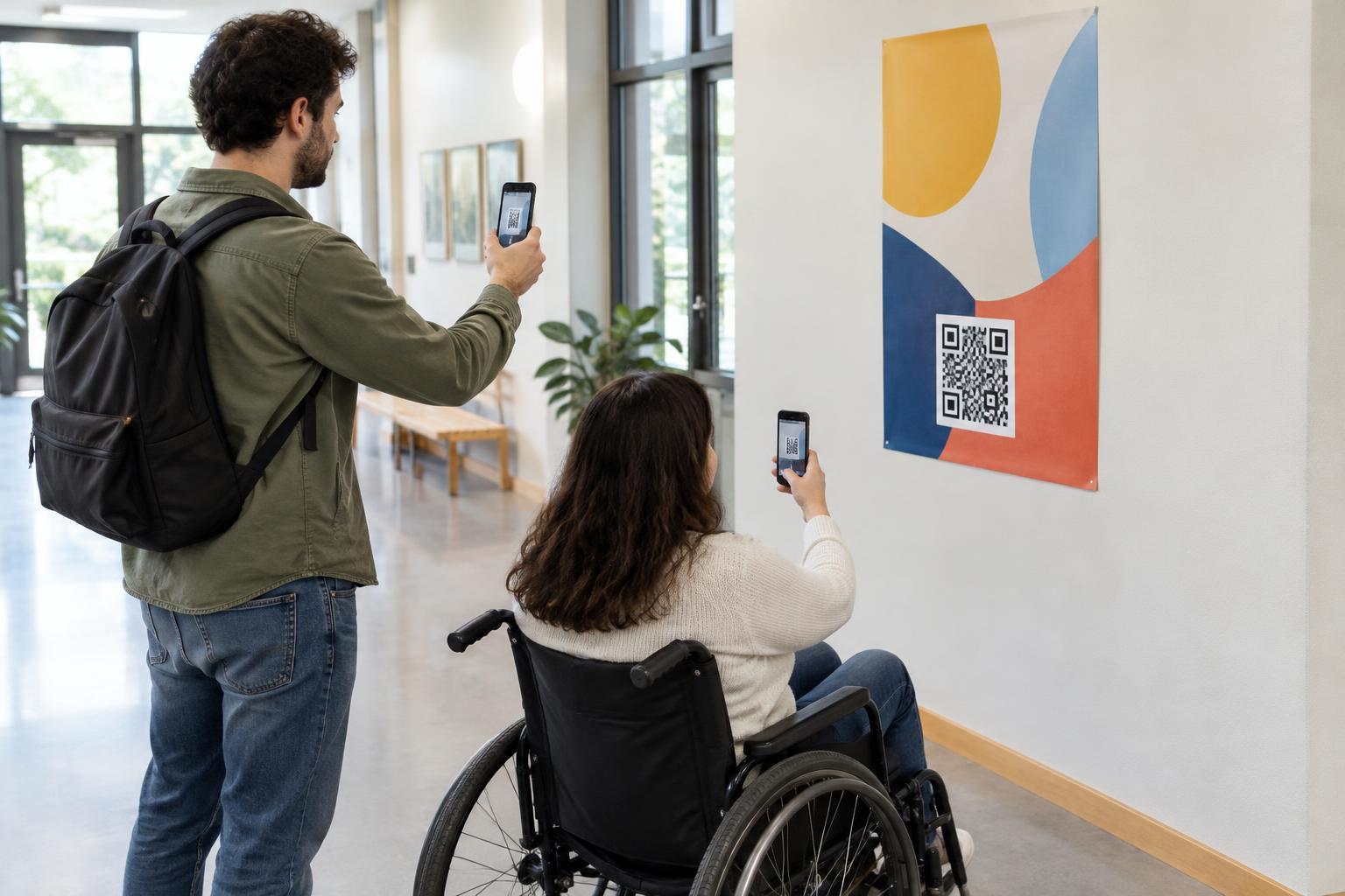
Design and PrintA poster QR code needs to be easy to notice, reach with a camera, and scan from the place where people naturally stand. Learn how to choose a height, size the code for viewing distance, and test the finished poster before printing a full run.
Read article · 4 min↗
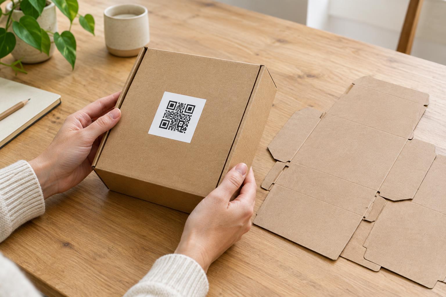
Design and PrintA QR code can look clear in a design file but become difficult to scan after a label is cut, a box is folded, or a package is sealed. Learn how to plan placement around those finishing details and test the finished item.
Read article · 3 min↗
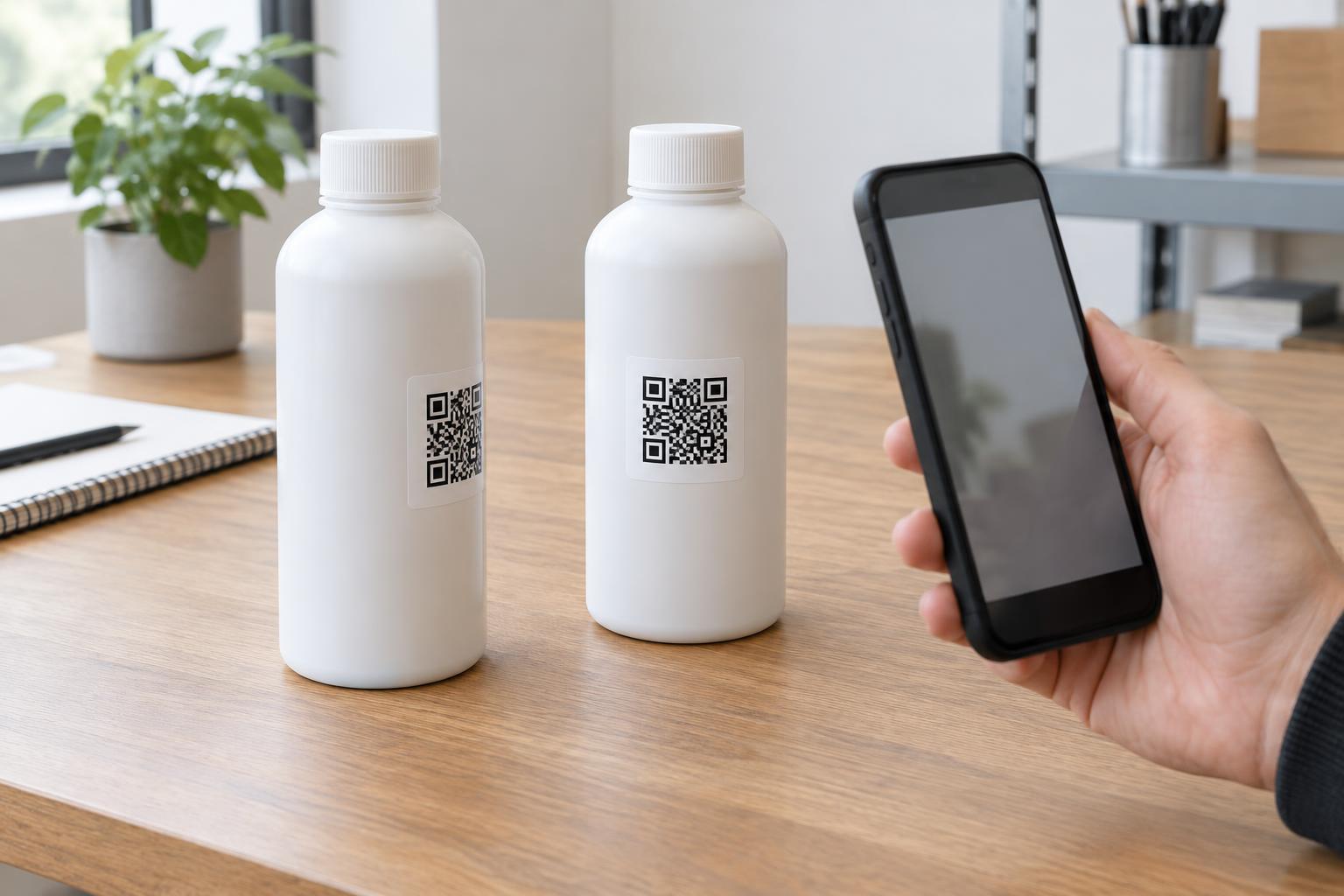
Design and PrintA QR code that scans easily on a flat proof may be harder to read once it wraps around a bottle, can or tube. Learn how curvature, placement, contrast and hands-on testing can help make packaging codes more reliable.
Read article · 4 min↗
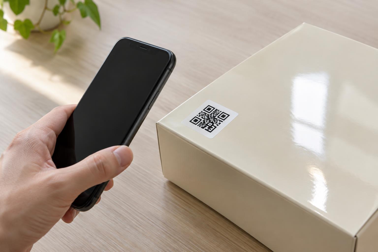
Design and PrintGlossy packaging, labels, and signs can make a QR code look sharp while making it harder to scan. Learn how reflections affect a code, which design and placement choices help, and how to test a finished print in realistic lighting.
Read article · 4 min↗
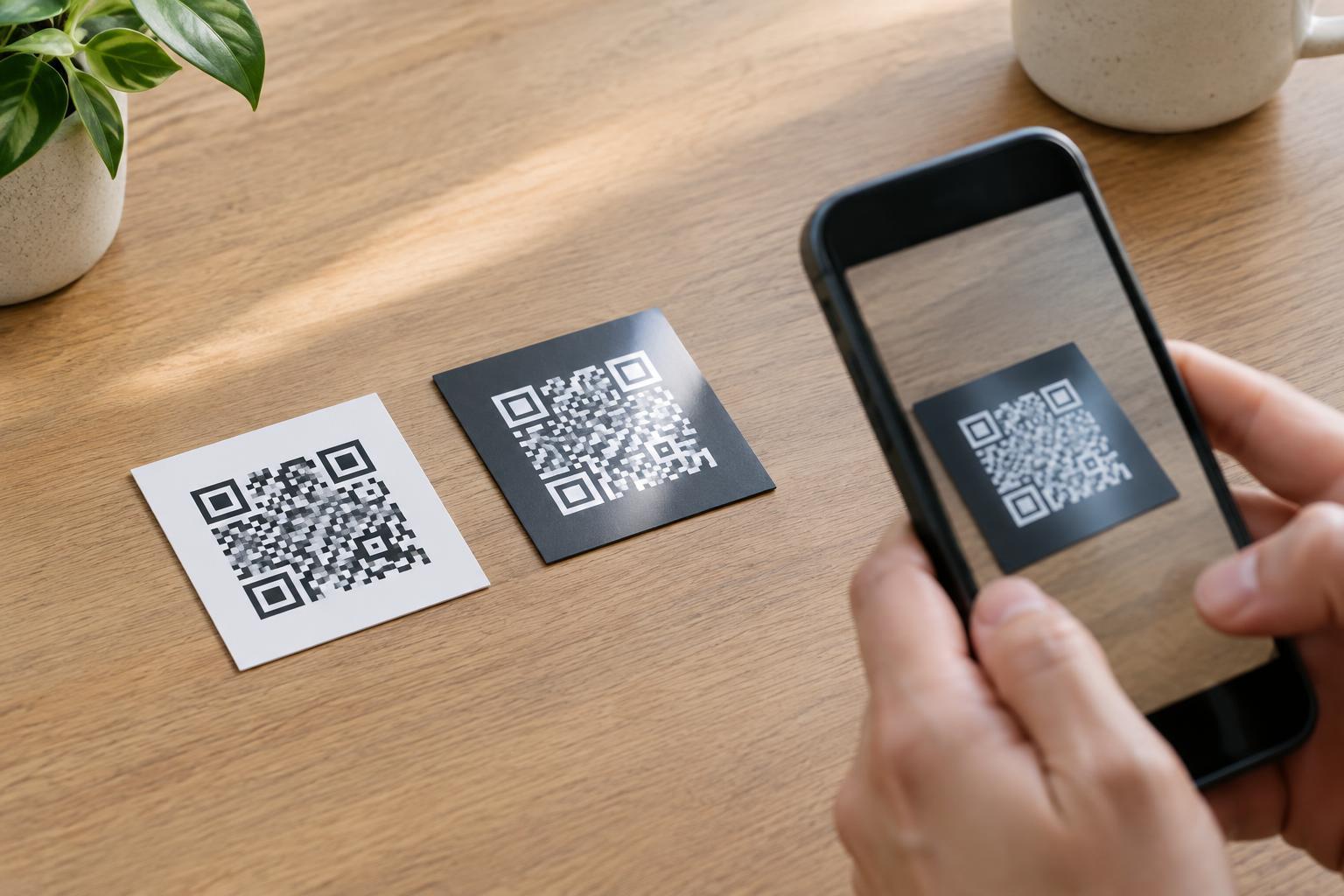
Design and PrintA QR code with light squares on a dark background can look striking, but it may be harder for some cameras and scanning apps to read. Learn why polarity matters, how print choices affect contrast, and what to test before using an inverted code.
Read article · 3 min↗
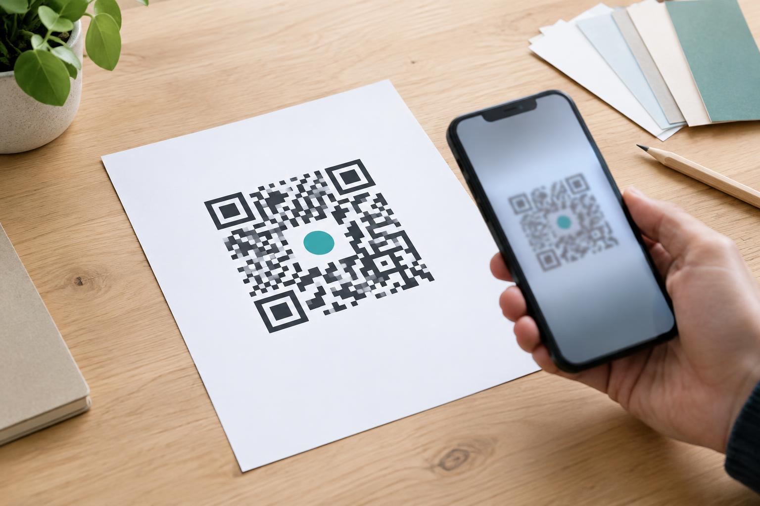
Design and PrintA logo can make a QR code feel like part of a brand, but it also covers information a phone needs to scan. Learn where to place a logo, why contrast and quiet space matter, and how to test the finished design before printing.
Read article · 4 min↗
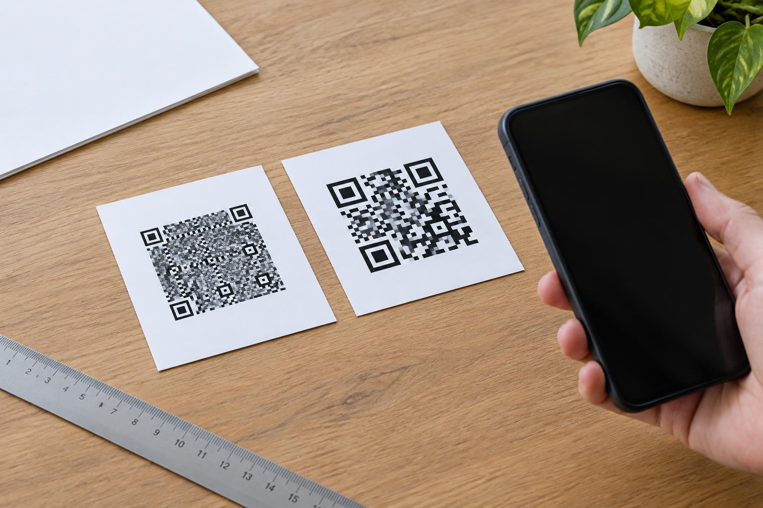
Design and PrintA long web address can make a QR code harder to print and scan. Learn why that happens, when a shorter destination helps, and how to check a code before it goes on a sign, label, or flyer.
Read article · 4 min↗
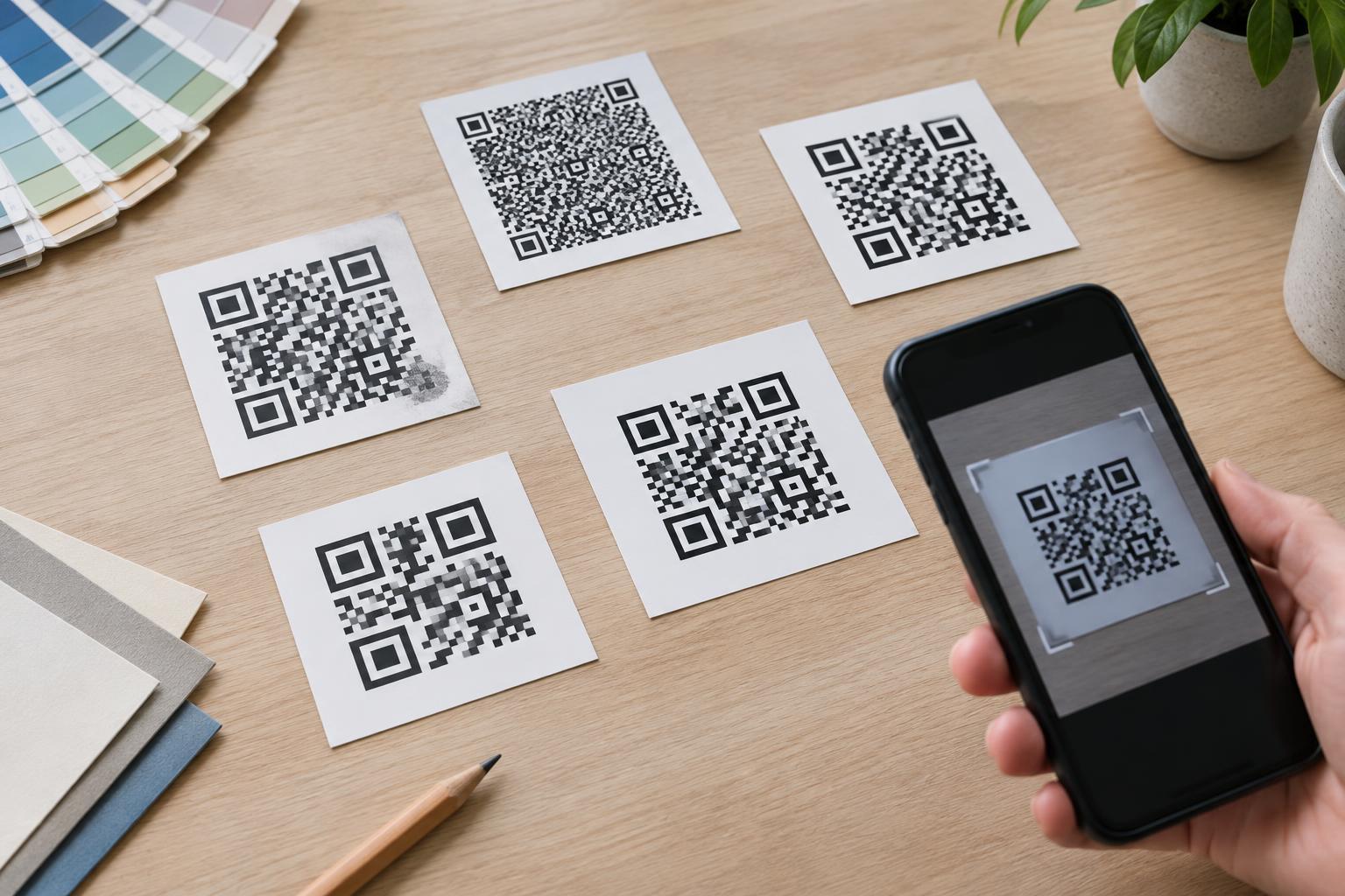
Design and PrintQR codes can recover some information when part of the pattern is unreadable, but greater error correction also takes up more space. Learn what the four levels mean and how to choose one for a clear, scannable print design.
Read article · 4 min↗
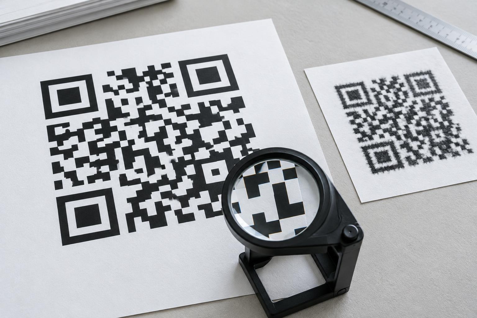
Design and PrintA QR code can look crisp on screen and still fail after printing. Learn how file format, output size, resolution, and print conditions affect its square modules—and how to check a proof before producing a full batch.
Read article · 4 min↗
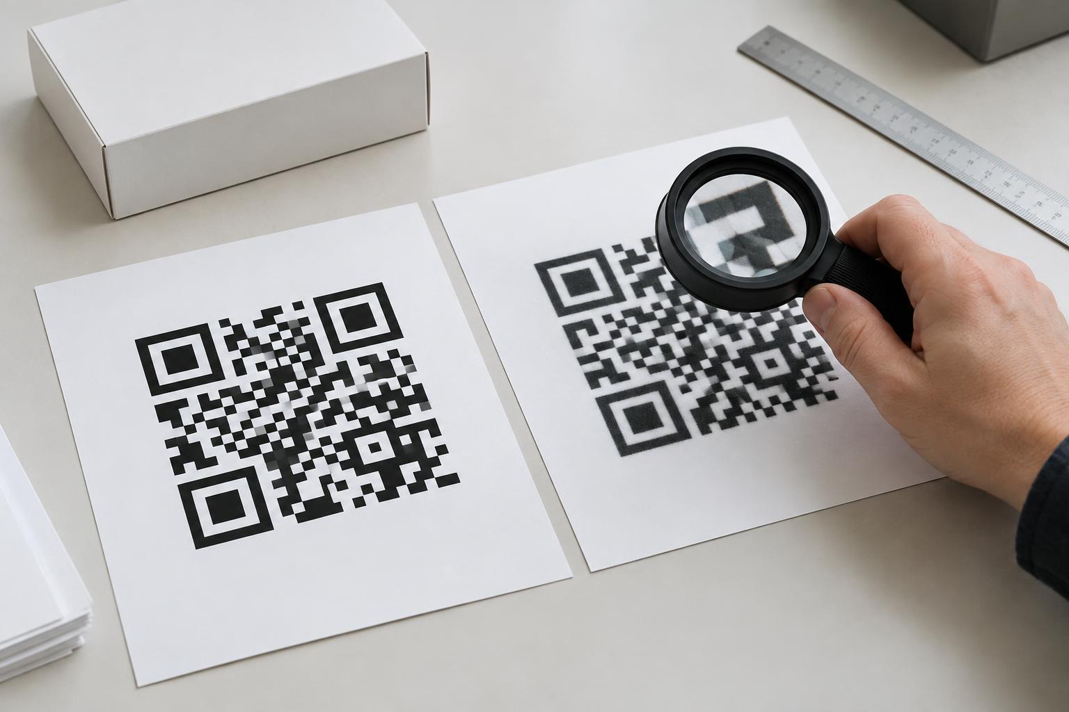
Design and PrintA QR code may look sharp on your screen but print with soft edges or too little clear space around it. Learn when to send a vector file, when a raster image is sufficient, and what to check before approving a print run.
Read article · 4 min↗
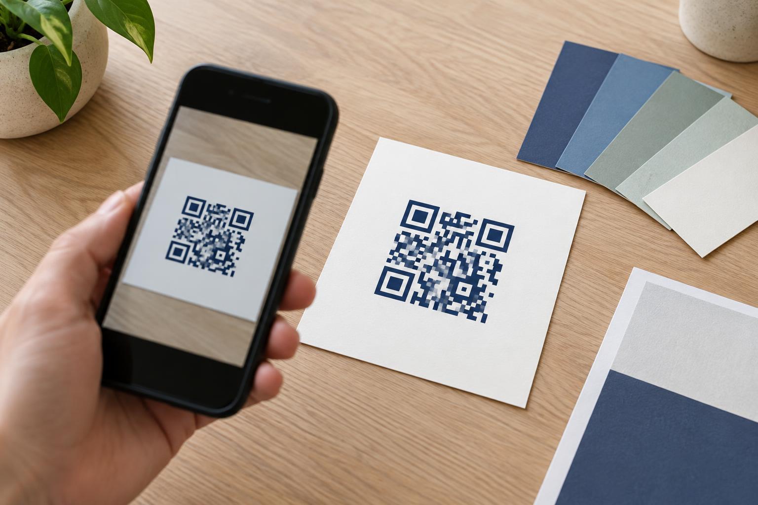
Design and PrintA QR code can match your design and still be easy to scan. Learn why dark foregrounds and light backgrounds are the safest starting point, how print materials affect contrast, and what to check before publishing.
Read article · 3 min↗
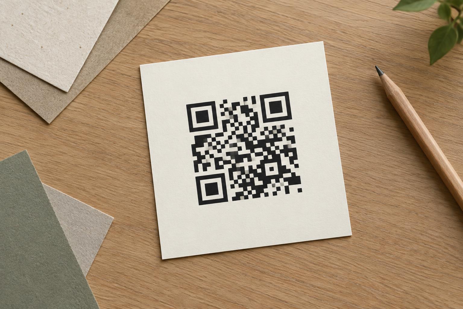
Design and PrintA QR code needs more than a clear pattern. The blank margin around it helps a scanner recognize where the code begins and ends. Learn how to preserve that space in digital designs and printed materials.
Read article · 3 min↗
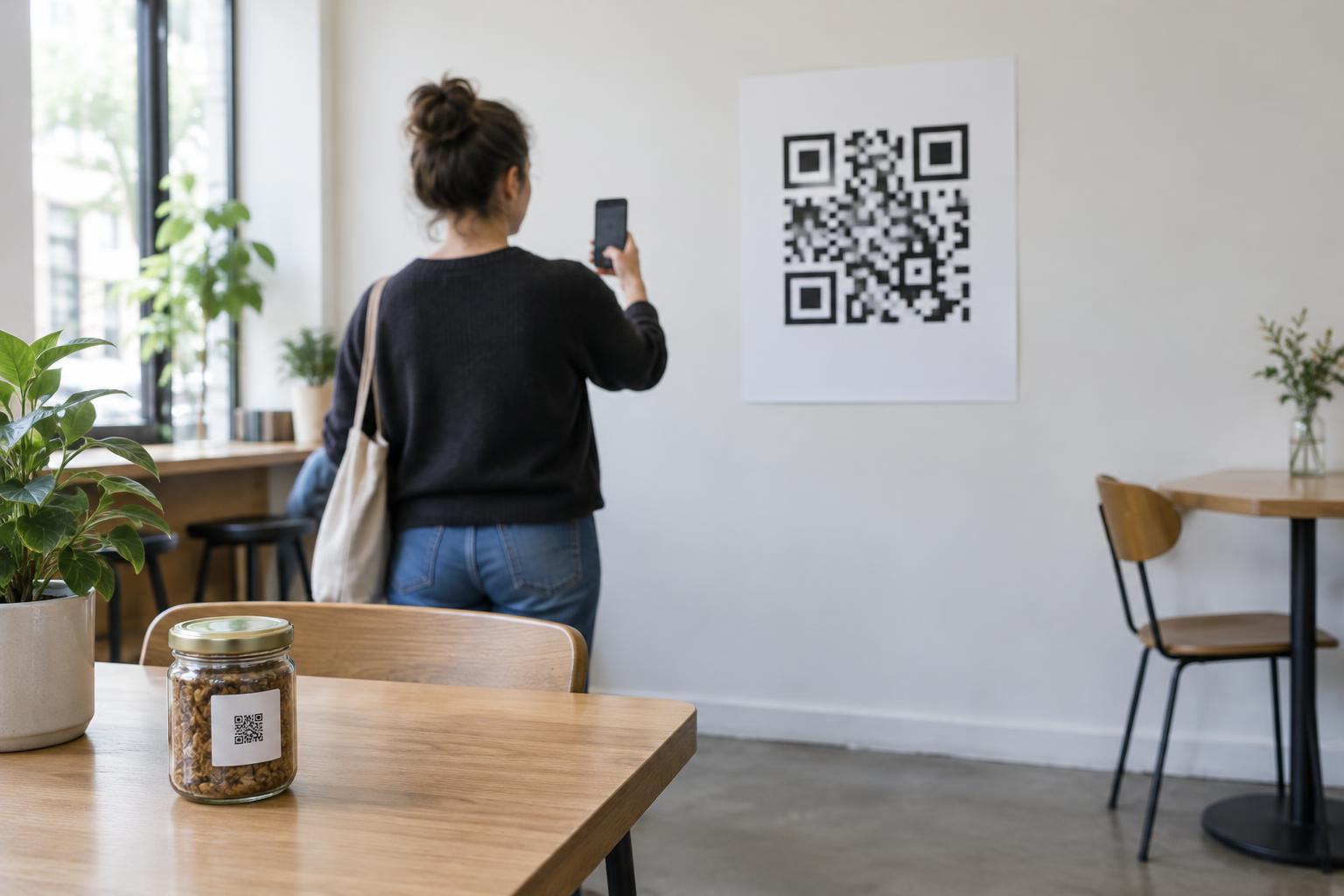
Design and PrintA printed QR code needs to be large enough for the camera to distinguish its individual squares from the distance people will scan it. Learn a practical starting rule for sizing codes on labels, signs and posters, then test the finished print where it will actually be used.
Read article · 4 min↗