Give the code one clear purpose
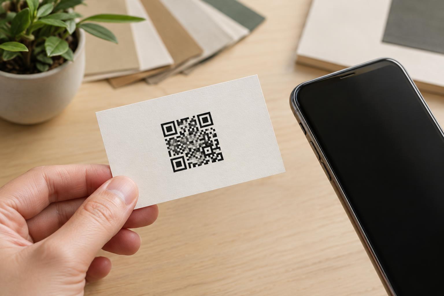
A business card already carries essential details in a compact space. Before adding a QR code, decide what it should help someone do. It might open a contact page, a portfolio, an appointment page, or a digital contact card. Choose the destination that best continues the conversation someone would have after receiving the card. A code with a clear purpose is easier to label and easier for the recipient to understand.
Keep the printed information useful without a phone. A person may be unable or unwilling to scan, so include your name, organization if relevant, and at least one direct way to reach you in readable type. Add a short instruction beside the code, such as “Scan to view my portfolio.” That label explains what will happen without making the recipient guess. If the destination is a web page, consider printing a short, readable address as an alternative, provided it fits without crowding the card.
Reserve space for the whole code, not just its pattern
On a small card, the temptation is to shrink the QR code until it fits a leftover corner. Instead, treat it as a planned element of the layout. Reserve room for the square pattern and an uninterrupted blank margin around it, often called the quiet zone. Text, borders, photographs, and decorative marks should stay out of that margin. If the layout is crowded, removing a nonessential element is usually a better first step than shrinking the code.
Place the code where it can lie flat and be seen in full. Keep it clear of rounded corners, punched holes, and the edges where printing or trimming may cut into it. A two-sided card can give the code a less cluttered home: one side can prioritize identity and contact details, while the other carries the code and its label. This is not a requirement, but it can make both sides easier to use.
Choose artwork and materials with scanning in mind
The code should have strong contrast against a consistent background. A dark pattern on a light, plain area is a straightforward starting point. Avoid placing the code directly over a photo, textured illustration, or color gradient, even if the design looks attractive on a screen. Fine details can change when printed, and a busy background can make the edges of the small squares harder for a camera to distinguish.
Print finish matters too. A reflective coating can create glare under some lighting, while an embossed surface or heavy texture may interrupt the pattern. If a special finish is central to the card design, consider leaving an uncoated, smooth area for the code. Supply the printer with artwork that remains sharp at the card’s final size, and do not stretch the QR image to fit a rectangular space. Scale it proportionally so the pattern stays square.
Test the card as someone else will receive it
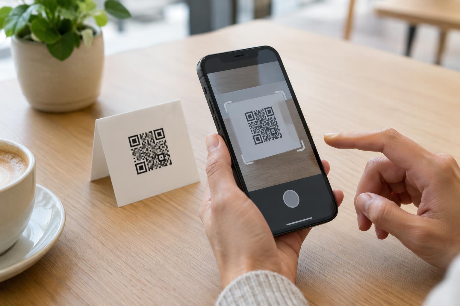
A scan from a large image on your monitor does not prove that the printed card will work. Test a proof at the intended size, on the intended material and finish if possible. Scan it with more than one phone, from a comfortable hand-held distance, in ordinary indoor light. Try the card while holding it naturally rather than carefully flattening and positioning it for the camera. If scanning takes repeated attempts, revise the design before ordering a larger print run.
Check the result after the scan as carefully as the scan itself. Confirm that the destination opens, is appropriate for a phone screen, and matches the promise printed beside the code. Review the final proof for trimmed margins, legible contact details, and a code that remains free of scratches or decorative overlays. Once cards are in use, keep the destination available for as long as you expect people to keep them; a well-printed code is only helpful when it leads somewhere useful.