Give the code one clear job
Pickup can become confusing at the last step: a customer has placed an order but does not know which door to use, where to park, or how to tell staff they have arrived. A QR code can open a page that answers those questions. It is most useful when it reduces uncertainty at a specific point in the journey, rather than acting as a generic link to the business homepage.
Start by deciding who needs the code and when. A code in an order-ready message might lead to directions and pickup hours. A code on a parking sign might lead directly to arrival instructions. Those are different situations, so they may call for different pages or different starting points on the same page. Give each code a short label, such as “Scan for pickup instructions,” so customers know what to expect before they open it.
Build the page around the next action
Put the most immediate information first: the pickup location, hours, and what the customer should do on arrival. If there are multiple entrances, describe the correct one using recognizable landmarks or sign names. Explain whether customers should wait in their vehicle, go to a counter, or call a posted number. If staff need an order number or name, say so plainly.
Keep the page short enough to use while standing outside or sitting in a parked car. A simple heading, a few steps, and a visible way to get help are often more useful than a long explanation of the ordering process. If customers may need to present a confirmation message, tell them where to find it. Avoid putting sensitive order details on a page that anyone can open by scanning a public sign.
Consider what happens when something changes. Pickup hours, parking arrangements, and staffing procedures may vary. Assign someone to check the linked instructions whenever those details change, and remove outdated signs promptly. If a page cannot be maintained, a narrow set of stable directions may be safer than detailed promises that could become inaccurate.
Place signs where customers make decisions
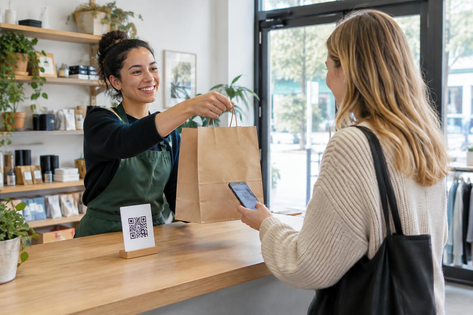
A pickup sign should be visible before a customer must choose a lane, entrance, or parking spot. It should not require them to stop in a driveway or block a doorway to scan. At a collection counter, place the code where a waiting customer can reach it comfortably without leaning over another person. Keep enough space around the code, use strong contrast, and avoid glossy or curved surfaces that make scanning harder.
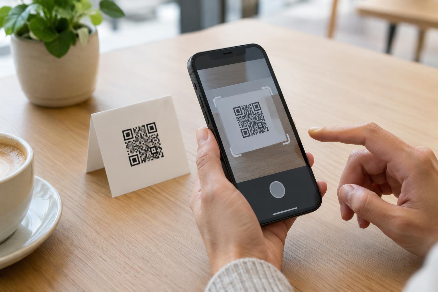
Test the printed code with more than one phone at a realistic distance and under the lighting customers will encounter. Check the full path, not just whether the camera recognizes the pattern: does the link open, load on a mobile screen, and show the correct instructions? Test again after the sign is installed, since reflections, height, and nearby notices can affect whether people notice and use it.
Keep scanning optional and protect customer information
A QR code should not be the only way to complete pickup. Print essential directions on the sign as well, and provide a clear alternative such as a staffed counter or phone number where appropriate. This helps customers whose phones are unavailable, who cannot scan comfortably, or who prefer not to open a link. Staff should know the same procedure shown on the page so a customer does not receive conflicting instructions.
For public signs, avoid links that reveal an individual order or ask customers to enter more information than the handoff requires. If a customer must sign in or confirm an arrival, explain why and make the destination easy to recognize. A short description beside the code can help customers decide whether to scan, while regular sign checks can catch damaged labels or unauthorized stickers placed over the original code.
Review the handoff, not just the scan
After rollout, ask staff which questions customers still ask and where queues or wrong turns occur. If people scan but still call for directions, the page may be missing a landmark or burying the arrival step. If nobody scans, the printed instructions may already be sufficient—or the code may be poorly placed. Neither outcome can be understood from scan activity alone.
Make small changes based on the customer’s task. Move a sign closer to a decision point, shorten the first screen of instructions, or clarify what “arrived” means. The goal is not to make every customer scan. It is to help each person complete pickup without unnecessary searching, waiting, or sharing of information.